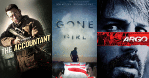


When we think about what makes a movie memorable, we often focus on the acting, direction, or special effects. But long before we see a single frame of the actual film, there’s one crucial element that begins telling the story: the movie poster. These carefully crafted images serve as both art and advertising, creating our first connection to a film that might last a lifetime.
In today’s digital world where streaming thumbnails and social media ads compete for our attention, you might wonder if traditional movie posters still matter. The answer is a resounding yes. Let’s explore why these single-frame masterpieces remain so powerful and how they shape our relationship with cinema.
The Psychology Behind the Perfect Movie Poster
Movie posters have mere seconds to capture your attention as you walk through a theater lobby or scroll through upcoming releases. This limited window means every element must serve a purpose. Color psychology plays a massive role here – horror films often employ reds and blacks to trigger feelings of danger and fear, while comedies frequently use bright yellows and blues to evoke happiness and lightness.
The human brain processes images about 60,000 times faster than text, which explains why posters rely heavily on visual impact over wordy descriptions. Our eyes typically scan an image in a Z-pattern, which is why many posters position the most important elements (main characters, title) along these natural viewing paths.
The most effective posters trigger an emotional response almost instantly. Think about the iconic “Jaws” poster with its underwater perspective of a swimmer above and massive shark below. Before reading a single word, you already feel the tension, danger, and vulnerability. That immediate emotional connection is what separates good posters from truly great ones.
Evolution of Movie Poster Design
Movie posters have undergone fascinating transformations throughout film history. Early cinema posters from the 1920s-1940s often featured painted illustrations with dramatic, theatrical scenes trying to convey the spectacle of this new medium. These classic posters now fetch thousands of dollars from collectors who appreciate their artistic value.
The 1950s and 60s saw more experimental approaches, with minimalist designs and bold typography emerging alongside traditional illustrated styles. By the 1970s and 80s, the illustrated movie poster reached its golden age with artists like Drew Struzan (who created iconic posters for “Star Wars,” “Indiana Jones,” and “Back to the Future”) defining what many still consider the classic movie poster look.
The digital revolution of the 1990s and 2000s brought photographic composites to the forefront, often featuring floating heads of the main cast arranged in a hierarchy of star power. While this approach has been criticized for lacking creativity, it effectively communicates the film’s genre and starring actors at a glance.
Today, we’re seeing a revival of more artistic approaches, with studios commissioning multiple poster designs including minimalist versions that appeal to design-conscious audiences. This renaissance acknowledges that posters aren’t just marketing tools but collectible art pieces that fans want to display in their homes.
The Elements of an Unforgettable Movie Poster
What makes certain movie posters stand the test of time while others are forgotten? The most memorable posters typically combine several key elements:
Striking Visual Concept
Great posters revolve around a single, powerful visual idea. The “Silence of the Lambs” poster with its death’s-head hawkmoth covering Jodie Foster’s mouth creates an unforgettable image that encapsulates the film’s themes of transformation and hidden horror. Similarly, the “Pulp Fiction” poster showing Uma Thurman lounging with a cigarette instantly communicates the film’s cool, retro vibe.
These concepts don’t just show what happens in the movie—they capture its essence in a single frame.
Strategic Use of Space
The arrangement of elements within the poster creates visual hierarchy and guides the viewer’s eye. Negative space (the empty areas) can be just as important as the filled areas, creating breathing room that draws attention to the most important elements.
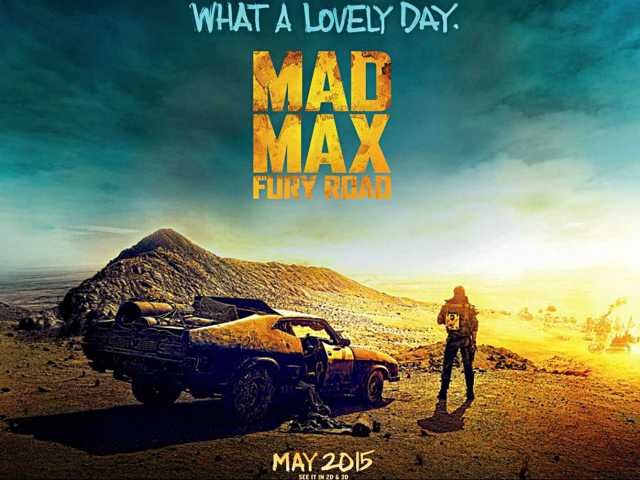
Consider the minimalist “Jaws” poster again, the vast blue space creates a sense of isolation and vulnerability that perfectly matches the film’s tone. In contrast, a crowded superhero movie poster might intentionally fill the frame to convey the epic scale and numerous characters involved in the story.
Typography That Tells a Story
The font used for a movie title isn’t just text—it’s an extension of the film’s identity. The dripping letters of horror movie titles, the chrome finish of science fiction films, or the playful fonts of children’s movies all communicate genre at a glance.
Some films create custom typography that becomes inseparable from the brand. The “Star Wars” logo, “Jurassic Park” lettering, or “Harry Potter” font are instantly recognizable even without any accompanying imagery. These distinctive typographic treatments often appear on merchandise and sequel posters, maintaining brand continuity across franchises.
Color Psychology in Action
Color choices are never random in professional poster design. The stark red and white contrast in “A Clockwork Orange” poster creates tension and unease. The warm oranges and blues in “E.T.” evoke wonder and emotion. The neon pink of “Drive” signals its stylish, retro-modern aesthetic.
Color combinations can trigger specific emotional responses and cultural associations. Many action movies use orange and blue (opposing colors on the color wheel) to create maximum visual impact and energy. Horror films often employ high contrast black and red to signal danger and death.
Beyond Marketing: Posters as Cultural Artifacts
Movie posters transcend their original promotional purpose to become cultural touchstones. The raised fist from “The Breakfast Club,” the silhouetted bicycle against the moon from “E.T.,” or the white suited figure from “Saturday Night Fever” have all entered our collective visual vocabulary.
These images become shorthand for entire films and sometimes for entire eras of cinema. They get referenced, parodied, and homaged in other media, extending their cultural impact far beyond the original release date of the film.
Some posters become more famous than the films they advertise. The Polish poster school, with its surrealist and expressionist approach to Hollywood films, created artwork that stands on its own artistic merit regardless of the quality of the movies themselves.
Collectors seek out rare original prints, with vintage posters from classic films fetching tens of thousands of dollars at auction. Museums and galleries host exhibitions dedicated to movie poster art, acknowledging their significance as commercial art that reflects changing visual trends and cultural moments.
The Digital Age Challenge
Today’s movie posters face unique challenges. They need to work across multiple platforms and at various sizes, from massive theater displays to tiny mobile thumbnails. This multi-format reality has influenced design trends, pushing toward simpler compositions with recognizable elements that remain legible at smaller scales.
Streaming platforms have changed how we browse films, with poster-like thumbnails becoming crucial in catching viewers’ attention as they scroll through endless options. These digital “posters” sometimes change dynamically based on viewer preferences or trending status, creating a more fluid concept of movie marketing imagery.
Despite these challenges, physical posters persist. Limited edition screen prints by artists like Mondo have created a thriving collector’s market for alternative movie posters. Studios recognize the value in commissioning artistic interpretations of their films, knowing that beautiful posters become shareable social media content and desirable merchandise.
The Poster Creation Process
Creating a movie poster involves numerous stakeholders and considerable strategy. The process typically begins during production, with photographers capturing still images specifically for marketing purposes. Designers then work with marketing teams to develop concepts that align with the film’s positioning strategy.
Major studios often test multiple designs with focus groups, analyzing which versions generate the most interest and correctly communicate the film’s genre and tone. This research-driven approach aims to maximize ticket sales by appealing to the broadest possible audience.
For independent films with smaller budgets, a striking poster becomes even more crucial. Without big-name stars or massive marketing campaigns, these films rely heavily on visual impact to stand out at film festivals and in digital marketplaces.
The Future of Movie Posters
As technology evolves, so do movie posters. Digital displays in theaters now feature motion posters (or “living posters”) that incorporate subtle movement and sound. Augmented reality posters allow smartphone users to scan the image and watch it come to life on their screens.
Despite these innovations, the fundamental principles of effective poster design remain unchanged: capture attention quickly, communicate genre and tone, create emotional connection, and leave a lasting impression.
The enduring power of movie posters lies in their ability to distill the essence of a two-hour experience into a single, compelling image. They promise adventure, romance, laughter, or thrills with just one glance. In our increasingly digital world, there’s something special about this tangible art form that continues to adorn bedroom walls and college dorms decades after a film’s release.
Movie posters remind us that first impressions matter. They’re the handshake before the conversation, the cover before the book, the glimpse before the journey. In the best cases, they become visual shorthand for the movies that shape our lives and the memories we make in darkened theaters, wide-eyed with anticipation for the stories about to unfold.